SiteApex Administration Help & Tutorials
Please use the topic links below to see a list of tutorials for that particular topic or module. Or you can use the search button to search for help on a specific topic.
Note: there are a few non-default modules listed here. Please contact sales if you are interested in any of these modules.
- Getting Started
- Page Editing
- Ad Manager
- Blog Module
- Bulletin Board (BBS)
- Calendar Manager
- File Manager
- Form Builder
- League Module
- Media & Resource Library
- News Letters
- News Manager
- Photo Album
- Staff List
- Shopping Cart
- Directories Module
- Indexed Articles
- Questionnaires
- Job Posting
- Mobile Devices
- Control Panel
- SMTP - Outgoing Mail
- Security & User Groups
- Templates
- Plugins
- SEO
- WCAG / Website Accessibility
Tips for Responsive Pages with Tables
Tables can often have too many columns to display on a small device. If the table shrunk in size it's quite possible that you would not be able to read the text as opposed to an image that is easier to view smaller.
How to make your Table more Responsive
Here are a few styles to improve table viewing on a device with a smaller screen.
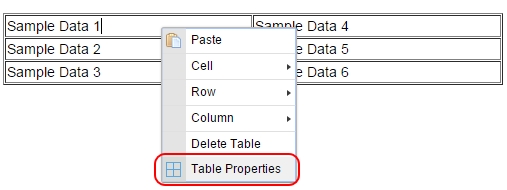
- Right click on your table. Click on Table Properties.
- Change the width from a set width to "100%".
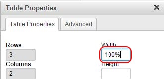
- Click "Ok"
This will allow your table to fit to the size of the window it's provided on various sizes of devices.
Setting Table Column Widths
Additionally you might want your columns to be different widths so in a percentage based table we recommend you determine what percentage, totalling to 100%, that you want each column.
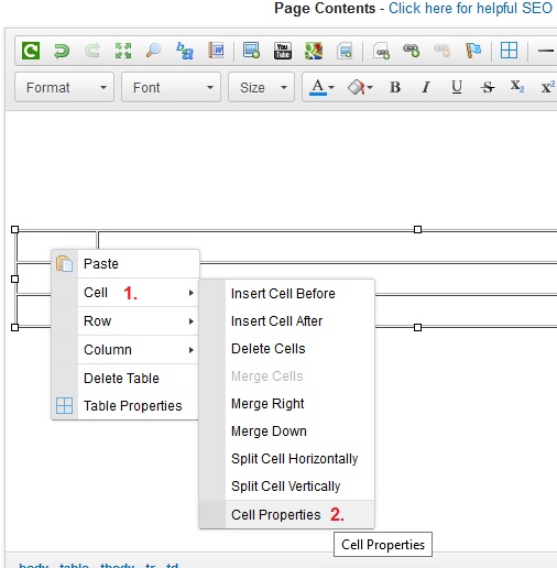
To do this you go into the Cell Properties by clicking in the first cell of the column you want to set the width and then right click.
- Right click Cell.
- Click "Cell Properties" as shown in the diagram:
On the Cell Properties pop-up you can then specifically use the percentage option to control the proportion of that cell compared to the others. In this example below we have set the first column to 10 percent:
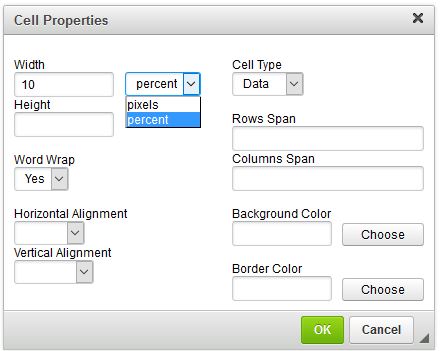
which immediately forces the other two columns to evenly share the remaining space in this 3 column example:
Adding a Horizontal Scroll Bar to your Tables
1. Around your table you will need to add a DIV tag. Easiest way to do this it to click on the Source button in the editor.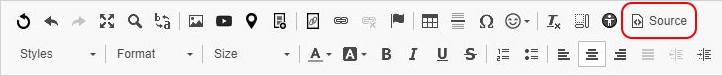
2. Before your table enter and immediately after your closing table a closing DIV.
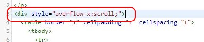
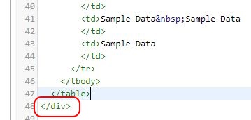
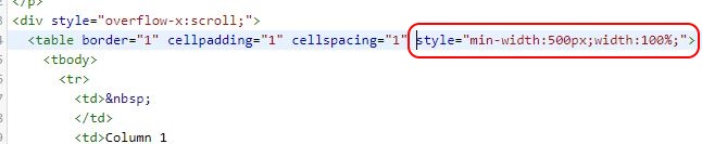
Finally enter these styles into your table: style="min-width:500px;width:100%;"
This should produce a scroll effect on only your table. This will allow site visitors access to the whole table without it cutting off the page on a smaller screen.