SiteApex Administration Help & Tutorials
Please use the topic links below to see a list of tutorials for that particular topic or module. Or you can use the search button to search for help on a specific topic.
Note: there are a few non-default modules listed here. Please contact sales if you are interested in any of these modules.
- Getting Started
- Page Editing
- Ad Manager
- Blog Module
- Bulletin Board (BBS)
- Calendar Manager
- File Manager
- Form Builder
- League Module
- Media & Resource Library
- News Letters
- News Manager
- Photo Album
- Staff List
- Shopping Cart
- Directories Module
- Indexed Articles
- Questionnaires
- Job Posting
- Mobile Devices
- Control Panel
- SMTP - Outgoing Mail
- Security & User Groups
- Templates
- Plugins
- SEO
- WCAG / Website Accessibility
Newsletter Table is Showing An Odd space when displayed in Microsoft Outlook
An issue has come up a few times where we've noticed that Microsoft Outlook (up to version 2010 as far as we can tell) displays a strange horizontal gap in emails it receives from our newsletter module. These gaps don't display using any other email client or email service (like Gmail, Hotmail, Yahoo, etc).
After doing some research and testing, we have determined that the issue is related to how Outlook displays html tables (nothing at all to do with our newsletter module). Outlook has a hard and fast rule where the maximum height of a table can only be 23.7 inches (aprox. 1790 pixels). If a table in an email it's trying to display exceeds this max height, it adds a break in the display before it continues showing the rest of the content.
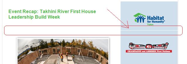
See the screennshot below. This newsletter was designed using one long table which exceeded Microsoft Outlook's maximum height of 23.7 inches. Right at that point, you can see the gap that Outlook inserted into the newsletter which actually extends across the entire table (it's just not visible on top of the white background).

This break in the display can be large or small depending on what Outlook is trying to render, but either way, it can ruin your beautifully designed newsletter email.
How to Get Around This Microsoft Outlook issue?
In order to get around this issue, we recommend stacking 2 or more tables on top of each other instead of using just one long table to create your newsletter. By stacking multiple tables on top of each other without any line breaks in between, the look of your newsletter can remain the same, but you can ensure that each individual table in your newsletter stays short and therefore remaining well under the maximum display limit in Microsoft Outlook.
If you look at the example below, I've rebuilt the newsletter pictured earlier - this time using a separate table for each section of the newsletter. Notice how there is no longer a gap showing.

