SiteApex Administration Help & Tutorials
Please use the topic links below to see a list of tutorials for that particular topic or module. Or you can use the search button to search for help on a specific topic.
Note: there are a few non-default modules listed here. Please contact sales if you are interested in any of these modules.
- Getting Started
- Page Editing
- Ad Manager
- Blog Module
- Bulletin Board (BBS)
- Calendar Manager
- File Manager
- Form Builder
- League Module
- Media & Resource Library
- News Letters
- News Manager
- Photo Album
- Staff List
- Shopping Cart
- Directories Module
- Indexed Articles
- Questionnaires
- Job Posting
- Mobile Devices
- Control Panel
- SMTP - Outgoing Mail
- Security & User Groups
- Templates
- Plugins
- SEO
- WCAG / Website Accessibility
WCAG Compliance and Updating your Content
When you're updating your content in your sitemap, or any other area that the editor is available to use, there are a few key things to keep in mind to help keep your content WCAG compliant.
Headings
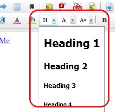
Use headings as opposed to styled text to organize your content. Heading 1 for your main title, then heading 2 for sub-titles and heading 3 for sub-sub titles, and so on...
You'll find the headings available under the paragraph drop-down in your editor.
This helps ensure that the structure of your page is easily seen and understood by people and by those using accessibility software.

Images
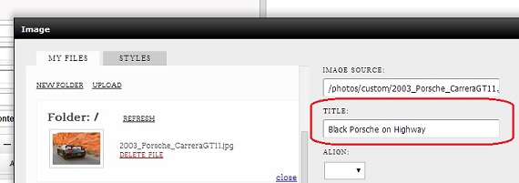
When adding images, be sure to fill in the Title field. This field is used as a text description of the image for screen reader software or when someone is unable to load the images on your page due to a slow internet connection.

Photo Album Images
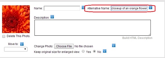
In addition to the above notes about images. If you are working in the photo album module. Make sure you fill out the alternative name field for the image. This will achieve the same affect as the above for you photo album images.

Tables and Cells
We would recommend avoid using tables if you are desiring a completely WCAG compliant website.
If you need tables it must be used for data purposes. It is also required to have column and row headers. Click Here for technical details on the subject. When using tables and cells, don't use absolute dimensions. So if you're adding a table to your page content, you will want to use a relative measurement like 100% width as opposed to an absolute measurement such as 600.
Contrast
Make sure you use high contrasting background and foreground colors. If you create a table and give it a blue background, then use a blue colored font, it's going to be difficult, if not impossible to read. Make sure you use highly contrasting colors so that your content is easy to distinguish. Light on dark, or dark on light are the main guidelines to keep in mind.
