SiteApex Administration Help & Tutorials
Please use the topic links below to see a list of tutorials for that particular topic or module. Or you can use the search button to search for help on a specific topic.
Note: there are a few non-default modules listed here. Please contact sales if you are interested in any of these modules.
- Getting Started
- Page Editing
- Ad Manager
- Blog Module
- Bulletin Board (BBS)
- Calendar Manager
- File Manager
- Form Builder
- League Module
- Media & Resource Library
- News Letters
- News Manager
- Photo Album
- Staff List
- Shopping Cart
- Directories Module
- Indexed Articles
- Questionnaires
- Job Posting
- Mobile Devices
- Control Panel
- SMTP - Outgoing Mail
- Security & User Groups
- Templates
- Plugins
- SEO
- WCAG / Website Accessibility
Creating Custom Form Questions
If you are not already editing a form follow these steps to begin:
- Logged into your websites administration.
- On the left menu find Form Builder in the Modules in Use menu list or hover over Modules
 and click on Forms.
 - Look for the form you wish to edit, and click the Edit link.
- Scroll to the bottom of the General tab and click on Save and Continue to Additional Fields

or click Create Form and Continue to Additional Fields if you are creating a new form.

Adding Custom Questions for your Form
Form builder has a number of custom field options such as text fields, multiple and single choice fields, and Payment fields options. A full list of each type and description is provided below.
Adding Your own Fields
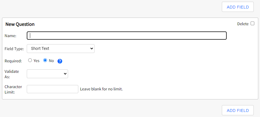
Once on the Additional Fields page you will see the following screen with options to create your own field or Add more.
You can add as many fields as you require.
Note: you can change the order of these fields by going to List Forms > Organize. Learn more how to change your forms layout.
Delete - Check off "Delete" if you wish to remove this custom field from your form. Please be wise about deleting fields and make sure you do not require this any further the data for this field will not display in the responses area. We highly recommend exporting the responses before deleting any important to you field.
Name - This is the question text you would like to ask or the title/description for the section.
Field Type - Select an option from the drop down that best suits how you want users to respond to the question. The different field types are explained below.
Required - Turning this on will force the user to complete this question before they can submit the form response. A pop up warning will ask them to complete the question if they have not answered any required fields.
Character Limit - This option will change depending on the field type you have chosen. For example with a "Short Text" field type chosen you can determine if there is a limit to how many characters they can type in their answer text field. Most field types have an option here some do not.
Once all the question(s) have been added scroll to the bottom of the page, and click the blue Submit button. This will take you back to the Forms list screen.
All of your changes are now live. No need to publish your pages.

Complete list Field Types
Short Text
A very short answer needing only one line of text.
Long Text
A longer answer needing several lines of text, also referred to as a "Comment” box.
Multiple Choice
Your visitor can select more than one answer if this option is used (for example: "choose all that apply"). You control the answers they can pick by typing them in the box below the field type drop down. Separate options with a comma. Options appear on the form as check boxes.
Single Choice Buttons
Your visitor can only select one answer if this option is used. You control the answers they can pick by typing them in the box below the field type drop down. Separate options with a comma. This field is most often used to choose between two items, such as "Yes" or "No". Options appear on the form as round buttons.
Single Choice List
Similar to the Single Choice buttons (above), your visitor can only select one answer if this option is used. You control the answers they can pick by typing them in the box below the field type drop down. Separate options with a comma. Options will appear on the form as a drop down list.
You can also use a 'single choice list' field to send the form response to a specific person. When you are creating the choices you will need to have a text option or name followed by a semi-colon and that persons email address. The choices would have to be divided by a comma. Example: Option A;email@address.com,Option B;email_b@address.com,Option C;email_c@address.com
When the submitter chooses Option B it will send the form response to Option B's email address email_b@address.com. Please note these are only example email addresses. Read more here about this option.
Limited Single Choice
This option creates a Single Choice List (above) but allows you to limit the number of times each answer can be selected. For example if you entered "Pizza;5,Subs;3,Burgers;10" the option Pizza can only be selected 5 times until it will disappear as an option in the drop down. You control the answers they can pick by typing them in the box below the field type drop down. Separate options with a comma. Options will appear on the form as a drop down list.
Other List
This option creates a Single Choice List (above) but allows users to select "other" and enter an answer that is not in your list in a box below. You control the answers they can pick by typing them in the box below the field type drop down. Separate options with a comma. Options will appear on the form as a drop down list with a text box for "other" below the drop down list.
Date Picker
Use this field to collect a date. When the site visitor clicks on the field it will open up a mini calendar view where they can click on the date they want. Date format collected is YYYY-MM-DD.
User Entered Payment Field
Allows the visitor to enter in the amount they will pay rather than you setting an amount. Especially useful for situations where you offer bids, partial payments or collect donations.
Product Field
When offering products or services that visitors can purchase, this field type allows you to enter the name of the product or service, price, minimum quantity, and taxes applied.
Recurring Payment (Moneris Gateway Required)
Allows you to setup a recurring payment from your customer from a credit card. Designed specifically for the Moneris Gateway Recurring System. Detailed setup is provided in the Information Icon when using this option.
Title
This option allows you to create a title within the form. Very useful for longer forms where sections should be clearly labeled. Use the "name" field to type your title.
Separator
This option will create a horizontal line on the form. Use with the Title field type to organize your forms.
Comment/Notice
Like the Title field (above), this field allows you to write notes or instructions throughout the form. Use the "name" field to type your comments.
File Upload
Allows users to upload a file that will be submitted with their form. This is perfect for contest submissions that require a photo or other accompanying file. This field has its own built in security feature that requires users to unlock the field before uploading. Displays on the form as a form field with "browse" button, along with a captcha security feature.
Quantity
Used in conjunction with a calendar event. Use this field to collect the amount of people registering to an event when using this form for sign up. Click here for more information on setting up Forms on Events.
Encrypted
Use this form to collect any information that you would like encrypted in the sites database. Only visible to anybody viewing the response that is part of the main Administrators security group.